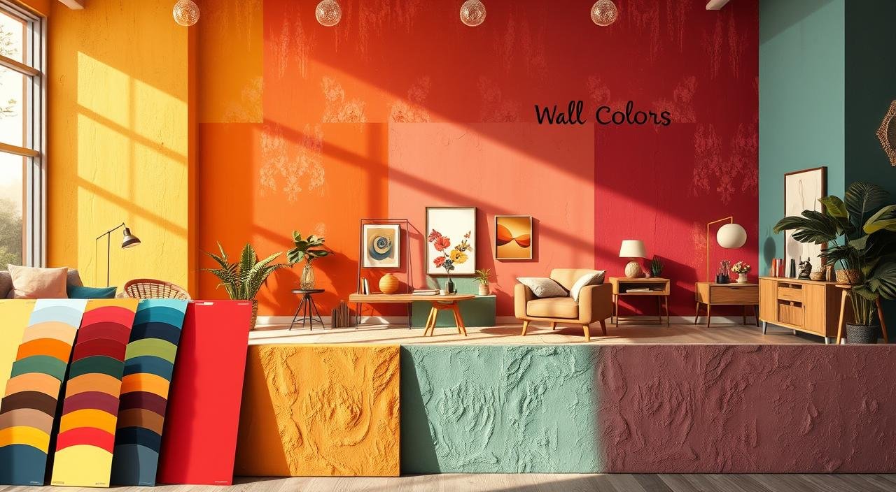
Find Your Perfect Wall Color: Top Trending Shades
Ever ponder why some rooms feel welcoming, while others seem off? Let’s uncover the secrets behind this with 2025’s top trending wall colors. Ready to change your space without a guess? I’ll guide you through it!
Top trending wall colors are more than just colors—they set moods. From Sherwin-Williams’ classic neutrals to Benjamin Moore’s soothing greens, these shades are crafted to complement your style. But how do you choose one that truly resonates?
Imagine your walls displaying Cloudy Blue by Pittsburgh Paints or Delicate Pink by Farrow & Ball. These choices aren’t random; they’re rooted in decades of design expertise. Ready to discover why warm oranges invigorate kitchens and cool blues soothe bedrooms?
Key Takeaways
- Neutral tones like beige and gray provide timeless backdrops for bold furniture.
- Warm colors like Ochre and Poppy Red energize high-traffic areas.
- Cool tones such as Sage Green and Lilac Purple enhance relaxation in bedrooms.
- Brands like Farrow & Ball and Benjamin Moore offer expert-curated shades.
- Matching wall colors to room function ensures lasting style without costly mistakes.
The Psychology Behind Wall Colors and How They Affect Mood
Ever walked into a room and instantly felt calm—or energized? That’s the power of color psychology at work. Cool, warm, and neutral tones shape your space’s vibe. This is why it matters for your home’s current wall color favorites.
How Cool Colors Create Calm Spaces
Cool hues like blues and greens lower stress levels by up to 15%*, making them perfect for bedrooms or home offices. Think serene shades like Behr’s “Quiet Pond” or Sherwin-Williams’ “Oxford Blue.” These trending interior paint colors create harmony without feeling cold—just add warm wood accents to balance.
Warm Colors That Energize Your Environment
Warm tones like reds and yellows boost energy and conversation. Benjamin Moore’s “Adirondack Red” or Farrow & Ball’s “Eau de Nil (a warm green)” spark creativity in kitchens or dining rooms. Use them sparingly—they can overwhelm in bedrooms. Pro tip: Pair with neutrals to keep things balanced.
Neutral Tones and Their Versatile Appeal
Neutrals like grays and beiges remain top current wall color favorites because they’re adaptable. Farrow & Ball’s “Pebble Dash” or Benjamin Moore’s “Simply White” let you experiment with decor without commitment. Add bold art or textiles to prevent monotony!
| Color Family | Mood Impact | Best Rooms |
|---|---|---|
| Cool Colors | Calming, relaxing | Bedrooms, home offices |
| Warm Colors | Invigorating, social | Kitchens, living rooms |
| Neutrals | Versatile, grounding | Any space |
Not sure? Test colors with apps like PaintSnap or use large swatches to see how they interact with light and furniture. Remember: your walls aren’t just walls—they’re mood boosters waiting to happen!
Top Trending Wall Colors for 2025
Ready to refresh your space with the latest trending paint colors for home? This year, the palette combines timeless neutrals with bold, nature-inspired hues. Let’s explore the trends making waves in design circles:

- Warm Neutrals: Brands like Sherwin-Williams are seeing love for Redend Point (a warm pink-beige) and Behr’s Blank Canvas. Both are ideal for cozy, grounding spaces.
- Vibrant Accents: Benjamin Moore’s Palladian Blue and Glidden’s Vining Ivy (a bold teal) add drama without overwhelming rooms.
- Rich Reds: Viva Magenta and Sherwin-Williams’ Red Barn bring energy—think dining rooms or accent walls.
Pro tip: Mix warm and cool tones for modern contrast. Take DIY confidence by starting with small accent walls! Experts like Jillian Shaible praise Benjamin Moore’s Raspberry Blush as this year’s boldest contender. Anne Hepfer’s Ultramarine Blue adds luxury.
Not sure? Test with paint swatches in your space—natural light changes everything. These top trending wall colors work best when paired with your personal style. Ready to pick your palette?
Earthy Tones: The Return to Nature-Inspired Palettes
Ever feel like your space needs a breath of fresh air? Look no further than the latest wall color trends rooted in nature’s palette. Brands like Farrow & Ball and Benjamin Moore are leading this shift. They prove that grounding hues don’t just follow trends—they create them. Let’s break down how these popular hues for walls can transform your home into a sanctuary.
“Biophilic design isn’t just a buzzword—it’s how we heal spaces. Earthy tones reconnect us to the natural world.”
Starting with terracotta and clay tones, think of Farrow & Ball’s Scallop or Behr’s Kalahari Sunset. These warm reds and oranges add Mediterranean flair without overwhelming small rooms. Ideal for dining areas or accent walls, they’re a cozy contrast to cool whites.
Next, sage green isn’t just a neutral—it’s a revolution. Brands like Sherwin-Williams highlight Reduced Green as a timeless choice. Pair it with metallic finishes for modern spaces or wood tones for rustic charm. KitchenAid’s Evergreen Stand Mixer matches this hue perfectly!
Lastly, warm browns like Behr’s Mocha Mousse or Sherwin-Williams’ Carriage Door bring sophistication. These work wonders in bedrooms or living rooms, balancing bold decor effortlessly. Their versatility makes them a staple in 2025’s “Warm Caramel” and greige movements.
| Color Name | Brand | Application |
|---|---|---|
| Scallop | Farrow & Ball | Living room accent walls |
| Reduced Green | Farrow & Ball | Modern kitchens or sunrooms |
| Mocha Mousse | Behr | Bedrooms or home offices |
Ready to dive deeper? Explore collections from Élitis’ Maestria or Perennials’ Down to Earth. Remember—earthy tones aren’t just paint choices; they’re a mindset. Let your walls breathe life into any room!
Bold and Dramatic: Statement Colors Making a Comeback
Ready to make a statement with your walls? This year, trending interior paint colors are bold and daring. Designers are embracing shades that are both luxurious and inviting. It’s time to break free from the norm and opt for colors that command attention.
“Moody tones create spaces that feel like a hug,” says interior designer Charlotte Lucas, championing Benjamin Moore’s Pinelands—a deep green-black hybrid that adds instant drama without feeling cold.

My top picks for wall paint include Sherwin-Williams’ Hot Cocoa, a rich cocoa-mauve that warms up modern spaces. Farrow & Ball’s Pitch Black is a timeless option for high-impact accent walls. For those craving color, Melanie Turner’s Sherbert hues like Benjamin Moore’s Apricot Bliss or Melanie’s Peachy Pink add playful energy to kitchens and living areas.
- Deep berry tones like Benjamin Moore’s Mulberry Mist create cozy dining nooks
- Jewel tones—think Behr’s Sapphire Noir or Valspar’s Emerald Rush—add sophistication
- Rustic reds like PPG Paints’ Terra Cotta Trek pair perfectly with reclaimed wood
Don’t fear the dark! Start small—try a single statement wall or pair moody tones with bright whites to balance the room. These trending interior paint colors show that bold choices don’t need to break the bank. They just require smart placement. Ready to transform your space? Let’s make your walls unforgettable!
Pastel Revolution: Soft Colors with Strong Impact
Soft pastels are making a bold comeback, proving that gentle hues can transform spaces with elegance and charm. These popular paint shades aren’t just for nurseries anymore—they’re now crossing over from fashion runways into living rooms. Let’s explore how these hues work their magic.
Blush Pinks and Their Enduring Appeal
Blush pinks like Sherwin-Williams’ “Sweet Pea” or Benjamin Moore’s “Softly” are modern neutrals. These hues flatter skin tones, making rooms feel warm yet sophisticated. Ideal for dining areas, they’re a top choice for top trending wall colors in 2025.
Sky Blues and Pale Lavenders
Think serene skies or lavender fields—these hues add calmness. Try Behr’s “Cloud Blue” for bedrooms or “Lavender Haze” for bathrooms. Their cool tones visually expand small spaces, perfect for cozy apartments.
Butter Yellow: The Unexpected Trending Shade
Butter yellow is stealing the spotlight in kitchens and sunrooms. Colors like “Cottage Grove Yellow” from PPG Paints bring sunshine without saturation. Pair with white trim for a timeless look.
| Shade | Hex Code | Best For |
|---|---|---|
| Blush Pink | #FFE4E1 | Dining Rooms |
| Sky Blue | #E0F0E9 | Bedrooms |
| Butter Yellow | #FFF5E6 | Kitchens |
Remember, pastels shine when paired with metallic accents—gold or brass add instant glamour. Mix and match with neutrals like white or gray to keep the look balanced. Ready to try a pastel? Start small with an accent wall—you’ll be surprised how much impact a whisper of color can make!
Room-by-Room Color Guide: What Works Where
Choosing the right wall color for each room is a delicate balance between function and personal touch. With numerous trending paint colors for home available, it’s essential to understand how each space functions. Warm tones energize, cool tones relax, and bold accents add flair. Let’s explore practical choices that transform rooms into functional havens, starting with a quick overview.
“Warm tones like reds and yellows energize spaces, ideal for living rooms or kitchens. Cool tones like blues and greens create calming vibes, perfect for bedrooms or home offices. Bold accent walls with vibrant colors can define areas in open layouts, adding visual interest. Using analogous color palettes for unity, such as pairing warm or cool tones, ensures a cohesive look.”

Living Room Color Strategies
Living rooms require balance. For large spaces, consider Benjamin Moore Classic Gray or Sherwin-Williams Pure White to maintain an airy feel. In smaller rooms, lighter shades like Behr Swiss Coffee 12 can make the space feel larger. Remember the 60-30-10 rule—60% dominant color, 30% secondary, 10% accent—to avoid visual clutter.
Bedroom Hues for Better Sleep
Bedrooms need to be calming. Opt for cool popular hues for walls such as Farrow & Ball Hague Blue or Benjamin Moore Chantilly Lace (a crisp white with gray undertones) to promote relaxation. Steer clear of bold reds or bright yellows, which are better suited for high-energy areas. Soft neutrals complement these cool tones, ensuring a soothing environment.
Kitchen Colors That Stimulate Appetite
Kitchens should have colors that inspire. Lighter greens like Sherwin-Williams Sea Salt or warm whites like Behr Blank Canvas keep the space fresh. For a focal point, consider a Benjamin Moore Gray Owl accent wall. A pro tip is to mix matte and glossy finishes to enhance brightness without overwhelming. Always test samples under your kitchen’s natural and artificial light!
Home Office Shades for Productivity
Home offices require focus-friendly tones. Soft grays like Behr’s Repose Gray or Benjamin Moore’s Gray Owl are ideal for keeping minds sharp. A muted green (like Benjamin Moore’s soft sage) can reduce eye strain. Stick to the “rule of three”—no more than three colors—to maintain focus.
Popular Paint Shades for Small Spaces
Think small rooms need to be all white? Think again! Let’s explore popular paint shades that open up cramped areas without sacrificing style. My go-to top picks for wall paint include light neutrals with warm undertones—they reflect light better than stark white! Try Farrow & Ball’s Cromarty, a warm gray that adds depth without closing in a room, or Benjamin Moore’s White Dove OC-17 for a bright, airy feel.

Looking for drama? Subtle jewel tones like Portola Paint’s Roman Clay in Burrow create warmth without overwhelming. For a modern touch, Sherwin-Williams’ Meander Blue adds visual interest while keeping spaces open. Avoid harsh contrasts—stick to monochromatic schemes using the same color on trim and walls to eliminate visual breaks.
- Light neutrals: Benjamin Moore’s Horizon OC-53 or Chantilly Lace
- Warm grays: Farrow & Ball’s Spare White or Benjamin Moore’s Gravel Gray
- Soft pastels: Coral Dust by Benjamin Moore or Sherwin-Williams’ Light Sky
Pro tip: Matte or eggshell finishes reflect light better than glossy options. Even bold choices like Ming Jade 2043-20 work in small rooms when paired with light wood tones. Ready to transform your space? These popular paint shades prove small doesn’t mean boring—your dream room is just a paintbrush away!
How to Test Paint Colors Before Committing
Ever picked a paint shade you loved in the store but felt mismatched in your space? Let’s make smart choices for trending paint colors for home without guesswork. I’ve helped countless clients avoid costly mistakes—here’s how you can too!

Begin with the large swatch method. Attach 2×2 foot foam core boards to walls. Pro tip: Apply two paint coats and wait 24 hours for them to cure. This method showcases how current wall color favorites like sage greens or terracotta hues perform in real settings.
Then, explore tech tools! Apps like Sherwin-Williams’ Color Expert allow you to virtually paint rooms. Yet, remember that screens can’t fully replicate natural light. Blend tech with these steps:
- Place swatches near windows, lamps, and mirrors.
- Rotate boards to check angles—how does that trending navy blue look next to your oak floors?
- Photograph swatches at noon, dusk, and night to see undertone shifts.
| Test Step | Action |
|---|---|
| Light Check | Observe how Benjamin Moore’s “Alabaster” changes under fluorescent vs. candlelight |
| Undertone Match | Hold swatches next to trim or cabinetry |
| Room Flow | Move samples between doorways and fireplaces |
Remember: current wall color favorites like soft pinks or warm grays act differently in every room. Ask yourself: Does this hue clash with my sofa fabric? Will it stay fresh in a year? Testing gives you the answers before you commit. Ready to paint with confidence?
Budget-Friendly Ways to Incorporate Trending Colors
Want to stay on top of wall color trends without spending too much? I’ve found ways to add trending interior paint colors to your space without breaking the bank. You don’t need to repaint every wall. Instead, focus on strategic, budget-friendly touches.
- Paint an accent wall in a trending hue like Behr’s Cracked Pepper or Sherwin-Williams’ Upward for instant drama.
- Create stripes with painter’s tape—use Benjamin Moore’s Simply White for crisp lines or a bold color like Glidden’s Limitless Yellow for a pop.
- Spruce up trim, doors, or cabinets with semi-gloss paint. Rust-Oleum’s Satin French Blue adds luxury to a kitchen island or bathroom vanity.
Need proof? Here’s how to maximize impact without breaking the bank:
| Method | Cost | Impact | Example |
|---|---|---|---|
| Striped Patterns | $15-$30 | High | Vertical stripes in Sherwin-Williams’ Renew Blue |
| Furniture Makeover | $20-$50 | Medium | Repaint a bookshelf with Krylon Bluebird spray paint |
| Hardware Refresh | $5-$10 | Low | Spray paint cabinet pulls with Krylon’s Matte Black |

Even small changes can make a big difference. Try stenciling floral patterns with a quart of paint—Glidden’s Limitless Yellow creates sunny floors or accent walls. Or update lamps and frames with trending neutrals like Behr’s Alabaster White. Remember: A gallon of paint can cover more than you think. Paint one chair, a console table, or a fireplace mantel for instant style.
Don’t forget about DIY tools! Invest in quality painter’s tape (FrogTape Pro) and a 2-inch brush for crisp lines. Pair with a roller for large surfaces. Mixing brands like Behr and Benjamin Moore? Test swatches first to avoid mismatches.
On a tight budget? Swap out cushions or a runner rug in trending colors. Target’s affordable “Elevate” collection offers throw pillows in soft blush (matching Sherwin-Williams’ Simply Soft) or earthy greens. Every little tweak adds up!
Color Coordination: Pairing Your New Wall Colors with Existing Furniture
Choosing the perfect wall color is just the start! Now comes the fun part—matching it with your existing furniture. Let’s turn your space into a cohesive masterpiece using simple rules anyone can follow. Start with the 60-30-10 rule: 60% dominant color (walls, floors), 30% secondary (furniture), 10% accents (art, decor). This timeless formula ensures balance, as explained in these expert guidelines.

| Wall Color | Furniture | Accents | Result |
|---|---|---|---|
| Soft Green (October Mist 1495) | Neutral or earthy furniture | Gold | Natural sophistication |
| Black (Black Raspberry 2072-20) | Light-colored furniture | White accents | Modern contrast |
| Gray (Chelsea Gray 2136-20) | Wood tones | Brass | Modern elegance |
Wood tones? Opt for current wall color favorites like Sherwin-Williams’ Gossamer Blue 2123-40 paired with white furniture—it brightens spaces without extra cost. For fabric sofas, test top picks for wall paint like Bellini (a peach undertone) to warm up neutrals. Metallics like gold or brass work magic: try nickel gray walls with gold trim to lift neutral rooms.
Stuck? Use paint samples under natural light to see how colors react to your furniture. Remember—small accents like throw pillows or rugs can tie the whole look together. Your home’s next transformation starts now!
Seasonal Color Trends: When to Refresh Your Walls
Paint colors evolve with the seasons, much like fashion trends. They serve as annual updates for your living space. Timing your refreshes is key. Spring calls for lighter latest wall color trends like Benjamin Moore’s Chestertown Buff or Sherwin-Williams’ Quietude, a soft sage. These hues are best in the early months. Deeper tones, such as Cinnamon Slate or Havana Affair, are ideal for fall. Trending paint colors for home often mirror nature’s cycles: warm tones in autumn, crisp whites in winter, and fresh pastels in spring.

- Spring: Pair pale yellows or mint greens with sunny DIY touches—try spring blooms in entryways to match lighter wall tones.
- Fall: Opt for deep greens (like Gloucester Sage) or warm neutrals like Swiss Coffee to embrace autumn’s coziness.
- Winter: Neutral grays like Revere Pewter keep spaces bright without overwhelming.
Pro tip: Latest wall color trends lasting 2+ years often have earthy tones or neutrals. Avoid fleeting pastels if you hate repainting yearly. Benjamin Moore’s Buxton Blue is a current example—it’s timeless enough for a decade but fresh enough for 2024. When in doubt, test swatches in natural light across seasons before committing. And remember: a bold accent wall costs less than a full repaint—perfect for testing trends without long-term commitment!
The Impact of Lighting on Your Wall Color Choice
Choosing the right wall color is more than just a matter of taste—it’s a science. Lighting can either enhance or detract from your preferred popular hues for walls. Understanding how to harness light can significantly impact your color choices. Modern design trends reveal that light direction and quality profoundly affect color perception. This is a fact many homeowners are unaware of.
“Lighting conditions are critical. Test samples in all light types to avoid surprises!”

In north-facing rooms, the light is cool and muted. Here, Whipped (a warm white) or Headspace work well, as they complement low light conditions. For south-facing areas, where direct sunlight is abundant, bold top picks for wall paint such as Poised or Poised Sage come alive. East/west rooms benefit from neutral shades like Natural Linen, which help balance the changing light.
| Color | Best Lighting | Effect |
|---|---|---|
| Black (Darkroom) | Layered with dimmable lights | Modern drama without feeling harsh |
| Sage Green (Pewter Green) | North or east windows | Calming, wood-friendly tones |
| Headspace Blue | All light types | Soft, adaptable ambiance |
Artificial lighting also plays a role. LED bulbs tend to highlight warm tones, while incandescent bulbs can mute cooler shades. My advice? Always test swatches at different times of day. Combining colors like Restrained Gold with smart lighting can create spaces that feel both intentional and harmonious. To start, consider painting an accent wall first. This will allow you to see how the color interacts with your home’s lighting.
DIY Painting Tips for Professional-Looking Results
Ready to bring those top trending wall colors to life without hiring a pro? Let’s dive into the secrets that transform DIYers into painting experts. I’ve spent years learning the difference between “good enough” and “wow.” Here’s how to achieve that wow factor.

- Tool Checklist: Start with a 9” angled brush for trim and a 3/8” nap roller for smooth walls. These are ideal for applying trending interior paint colors. Don’t forget a 4” extension pole for high ceilings. Also, painter’s tape and a putty knife are essential for prep.
- Prep like a pro: Begin by cleaning walls with TSP, filling cracks with spackling, and priming problem areas. A clean surface ensures your color stays vibrant and even.
- Pro technique: Paint trim first—it’s easier to clean drips while the walls are clean. Use a “W” pattern when rolling for full coverage.
- Edge magic: Tape edges with a 1.5” tape, pressing it firmly. Wait 20 minutes before painting to avoid lifting. Remove tape at a 45° angle when paint is dry.
The secret sauce is to always mix paint cans in a 5-gallon bucket before starting. This ensures your top trending wall colors are consistent from corner to corner. And never skip the wet edge! Work in 4×4’ sections to avoid streaks.
Need to repaint dark colors? Use two coats of primer first—this ensures your new hue shows up strong. Got textured walls? Opt for a medium-nap roller. And always clean brushes with mineral spirits after each use—they’ll last longer and apply smoother.
With these tricks, your living room’s sage green or terracotta accent wall will look like a pro did it. Ready to tackle that project? Your future self will thank you for the time saved and the flawless finish!
Trending Paint Finishes and Their Effects
Choosing the right paint finish is as critical as selecting the perfect shade. The latest wall color trends capture attention, but finishes like matte or glossy are what truly make or break a design. We’ll explore how different sheen levels can enhance your space’s ambiance and durability.
Benjamin Moore advises: “Choosing the right sheen will influence the ultimate look of your selected paint color. The higher the sheen, the greater the durability. Use semi-gloss for doors and trim; matte or eggshell for walls; and flat for ceilings.”

Matte finishes are the current wall color favorites for modern spaces. They soften light, making deep hues like navy or charcoal appear richer. Matte is perfect for hiding imperfections, making it ideal for living rooms or bedrooms.
In high-traffic areas like kitchens or hallways, eggshell or satin finishes are preferred. These finishes resist scuffs while allowing your color to shine. Warm grays or soft greens in entryways stay clean and chic. Latest wall color trends also favor eggshell for trim and baseboards.
High-gloss isn’t just for cabinets anymore! A glossy accent wall in deep red or cobalt blue adds drama without overwhelming. Use it sparingly, like on one wall or a ceiling for a “fifth wall” effect. It’s perfect for dining rooms or statement zones!
- Matte = modern elegance + easy upkeep
- Eggshell/satin = durability meets design
- Gloss = bold accents that last
Pairing finishes with your current wall color favorites is key. Matte enhances muted greens or terracotta. Gloss adds depth to neutrals whites or warm browns. Your choice impacts both style and practicality.
Ready to mix and match sheen levels? Let’s choose finishes that transform your color picks into timeless looks. Your walls deserve to look as good as they function!
Conclusion: Transforming Your Home with the Perfect Wall Color
Choosing the right wall color is more than a DIY project—it’s about creating spaces that feel as good as they look. Start with top picks for wall paint like deep terracotta or jewel tones, which balance style and durability. Popular paint shades like sage green or soft pastels offer timeless appeal. Bold hues like emerald green or sapphire blue add drama without overwhelming smaller rooms.
Remember: 65% of customer satisfaction comes from thorough testing. Always sample 3-4 colors and view them under different lighting to avoid surprises. Stick to 3-4 main shades across your home for cohesion. Align your choices with the room’s purpose—a calming sage in bedrooms, vibrant red in dining areas. Brands like Sherwin-Williams highlight that top picks for wall paint often stay in demand because they adapt to evolving trends while staying functional.
Whether you favor neutral bases with metallic accents or bold Art Deco-inspired hues, let your personality shine. Use this guide as your roadmap, but trust your instincts. A well-chosen color isn’t just paint on walls—it’s the foundation of spaces that inspire joy and comfort. Your home deserves colors that reflect your style, so start swatching, testing, and transforming today.
FAQ
What are the top trending wall colors for 2025?
How do wall colors affect mood?
What paint finishes work best for different areas of the home?
How can I test paint colors effectively?
What are some budget-friendly ways to incorporate trending colors?
How do I coordinate new wall colors with my existing furniture?
What are the best colors for small spaces?
Do lighting conditions really affect how paint colors look?
What paint brands should I consider for trending colors?
How can I achieve a professional-looking finish on my DIY painting project?

AUTHOR: MARIA JOSE VENTRAMELI
Specialist in Home Design, Architecture, and Trends
With years of experience writing for top home and lifestyle blogs, she now contributes to 17Vibes, offering practical, research-backed insights on renovations, smart technology, sustainable building, and modern living trends. Join our Facebook community here