
For years, I’ll admit, I viewed the discussion around color as something secondary—a final coat of paint applied by designers after the real engineering work was done. I was profoundly wrong. After visiting countless design studios, from Munich to Palo Alto, and speaking with the minds who define the look and feel of the products we love, I understood a fundamental truth: color is a technology. It influences our perception, guides our interaction, and defines an object’s value before we even lay a hand on it. That’s why understanding the color trends 2025 is critical not just for artists, but for anyone invested in technology, innovation, and industrial design.

Beyond Aesthetics: Why the 2025 Color Palette Matters in Tech
Before we dive into this year’s palette, it’s vital to understand why giants like Apple, BMW, and Samsung pour millions into color research. In product design, color is a silent language.
It’s a user interface (UI) component, creating visual hierarchy and calls to action. It’s a branding tool, capable of building an instantly recognizable corporate identity (think of Meta’s blue or Spotify’s green). Most importantly, it’s a psychological instrument. A color can make a product feel more expensive, more trustworthy, faster, or more approachable. These trends don’t emerge from a vacuum; they are a mirror, reflecting our collective mood, our anxieties, and our hopes for the future.
The Core Palette: My Analysis of the Key Color Trends of 2025
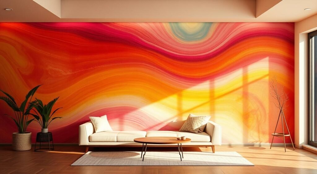
I’ve analyzed the reports from leading trend authorities like WGSN and Pantone and cross-referenced that data with what I’m seeing in the prototypes and product launches across the industry. For 2025, the palette is defined by a fascinating duality: on one side, energetic and synthetic digital tones; on the other, deep, grounding colors that reconnect us with the natural world.
Future Dusk: The New Face of Premium Tech and Privacy
WGSN named “Future Dusk” its color of the year, and I couldn’t agree more with its relevance. It’s a dark, moody, and contemplative shade—a blend of blue and purple that evokes the sky in that magical moment between sunset and nightfall.
- The Psychology: This color communicates mystery, sophistication, and a sense of escapism. In a world of digital overexposure, Future Dusk offers a visual sanctuary. It’s introspective and secure, almost like a chromatic “do not disturb” mode.
- My Application Analysis: I’m seeing this color dominate high-end EV interiors. Automakers like Genesis and Lucid are using similar shades to create cabins that feel like nocturnal lounges, where advanced ambient lighting and high-resolution screens can truly pop. In consumer electronics, it’s the perfect color for premium products. High-fidelity headphones from brands like Bang & Olufsen, pro-grade laptops, and even smart home appliances are adopting Future Dusk to communicate quality and seriousness. It’s a color that makes hardware feel more expensive and software feel more secure. This is one of the most significant color trends 2025 for the luxury market.
Cyber Lime: The Unavoidable, High-Energy Accent
At the complete opposite end of the spectrum is a color I’m calling “Cyber Lime.” Think of a near-fluorescent, hyper-synthetic green-yellow that feels like it was born inside a computer. It’s a color that hums with energy.
- The Psychology: This color screams AI, digital nature, and high-octane energy. It’s impossible to ignore, designed to grab your attention instantly. It represents a positive, albeit artificial, vision of the future where technology is exciting and vibrant.
- My Application Analysis: This is the ultimate accent color. You won’t see an entire car painted in Cyber Lime (at least, not from a major manufacturer), but you will see it everywhere else. I’ve seen it in the UI design for financial tech apps, used for “confirm” or “trade” buttons to create a sense of action and urgency. In the automotive world, it’s the new go-to for performance accents—the brake calipers on a new electric Porsche, the contrast stitching on an Alcantara steering wheel, the “launch mode” icon on a dashboard. It’s a trend that says “this feature is new, fast, and futuristic.”
Desert Bloom: Grounding Technology in the Natural World
As a direct response to the coldness of glass and metal, we have a powerful trend toward warm, earthy tones. The key color here is something I’m calling “Desert Bloom”—a rich, dusty terracotta shade with hints of apricot.
- The Psychology: This color is all about wellness, sustainability, and human connection. It’s grounding, calming, and authentic. In a world saturated with artificiality, a color like this feels honest and tangible. It evokes hand-crafted quality and a connection to the earth.
- My Application Analysis: This is the hero color for “calm tech.” Smart home devices, like Google’s Nest speakers and thermostats, are using these hues to make their products feel less like intrusive gadgets and more like decorative, ceramic objects. I’ve seen it used beautifully in the new Volvo interiors, particularly with their recycled and wool-blend textiles. It sends a clear message: “This technology is people-centric, sustainable, and good for you.” It’s one of the most emotionally resonant color trends 2025 is offering.
Ethereal Blue: The Color of Clarity and Wellness Tech
Finally, there’s a move towards ultra-light, airy pastels. The most prominent among them is “Ethereal Blue,” a shade so pale it’s almost white, with just the faintest hint of cool blue.
- The Psychology: This color represents clarity, serenity, cleanliness, and health. It’s calming and non-threatening, suggesting effortless functionality and a clean slate. It’s the color of fresh air and open spaces.
- My Application Analysis: This color is completely dominating the user interfaces of health, wellness, and meditation apps. It’s used to create a sense of calm and to make complex data (like health metrics) feel manageable and clean. I’m also seeing it appear on medical-grade consumer tech, like advanced air purifiers and smart water bottles. In automotive UIs, it’s being used for “serene” or “efficiency” driving modes, reducing the visual noise on the dashboard to help the driver focus. It’s the color of technology that works quietly and effectively in the background.
My Final Take: The Overarching Story of 2025’s Colors
Looking at the palette as a whole, a clear narrative emerges. The color trends 2025 tell a story of duality. We are living in an increasingly digital world, and we crave both the excitement of that synthetic frontier (Cyber Lime) and the safety of a dark, private digital space (Future Dusk).
At the same time, we’re experiencing a powerful counter-movement—a desire to ground our technology in something real and human. We want our gadgets to feel less like cold, calculating machines and more like warm, natural objects (Desert Bloom), and we want our digital experiences to bring us clarity and peace, not more stress (Ethereal Blue).
The most innovative companies I’m seeing are not just picking one trend; they are skillfully combining them. They are using a Future Dusk chassis with Cyber Lime accents. They are creating a UI in Ethereal Blue that controls a device finished in a warm Desert Bloom textile.
Color, I’ve learned, is never just a finishing touch. It’s the first word in the conversation between a product and its user. And in 2025, that conversation is more nuanced, emotional, and fascinating than ever.